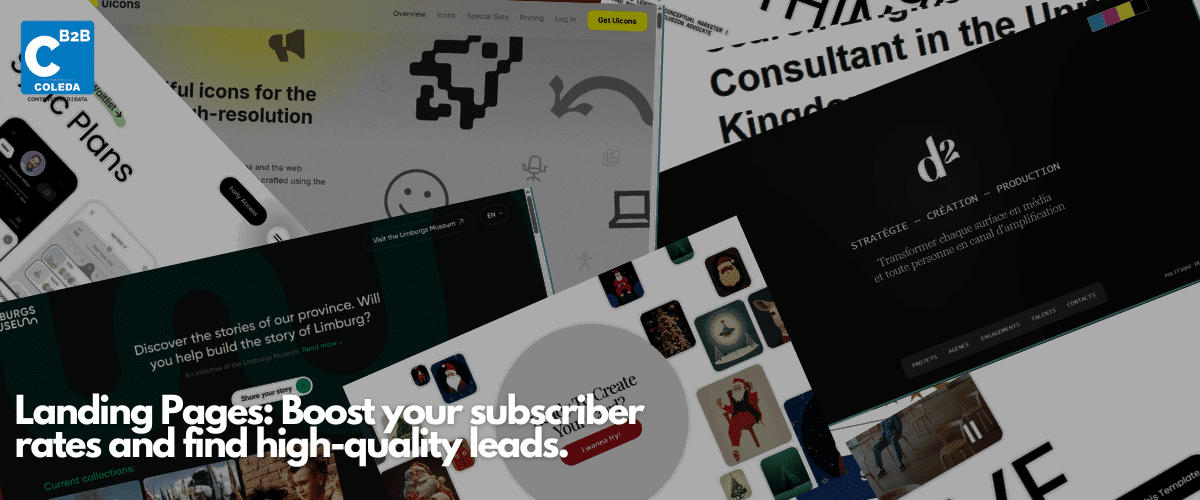
Landing pages bring focus to inbound marketing. These beautifully crafted pages are created for one reason and one reason only: to urge an audience to perform a desired action.
Yet, many marketers do not use landing pages for conversion. Either because of time limits or the lack of understanding of what a landing page must do. Landing pages are excellent in converting specific audiences, especially if a business is trying out ABM tactics. And they should be employed in marketing campaigns.
Landing pages bring focus to inbound marketing. (And why it is necessary to have landing pages in a marketing campaign)
What are landing pages?
A landing page is a web page that focuses on informing and calling the user to take a desired action.
Usually, a user reaches a landing page when they click an ad or a social media link. Landing pages are specific and focus on a single message to reach its intended audience. They are not cluttered and offer minimal navigation to avoid distracting users from the CTA.
Why are landing pages vital for a B2B business?
Landing pages are efficient tools that drive audience-to-lead conversion. They help deliver a clear and concise message to the user and urge them to action. Landing pages offer valuable information in exchange for the user’s details. A landing page can help end the search for high-quality Sales-Qualified Leads.
Valuable and actionable information will build
- Trust
- Brand voice
- Customer Relationship
Each landing page is created for a specific marketing campaign and caters to the intended message of the campaign.
But broadly there are two categories of landing pages.
The two types of landing pages are
Lead Generation pages
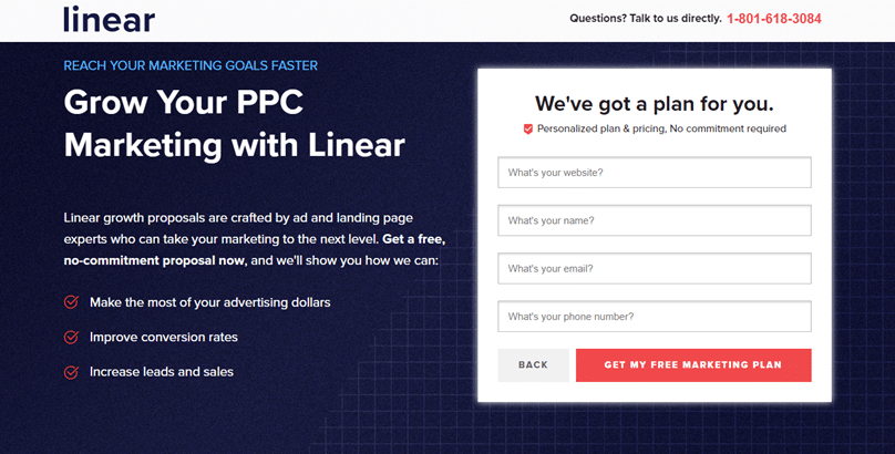
The intent of a lead generation or lead capture page is to collect information from the user in return for gated content. The information a lead generation landing page collects is specific to the marketing campaign.
What data is needed for a user to qualify as a lead? This question helps in creating a great lead-gen landing page! In some cases, the CTA can double as a quiz to help them download content specific to their problem. This method yields quality data.
Click-through pages
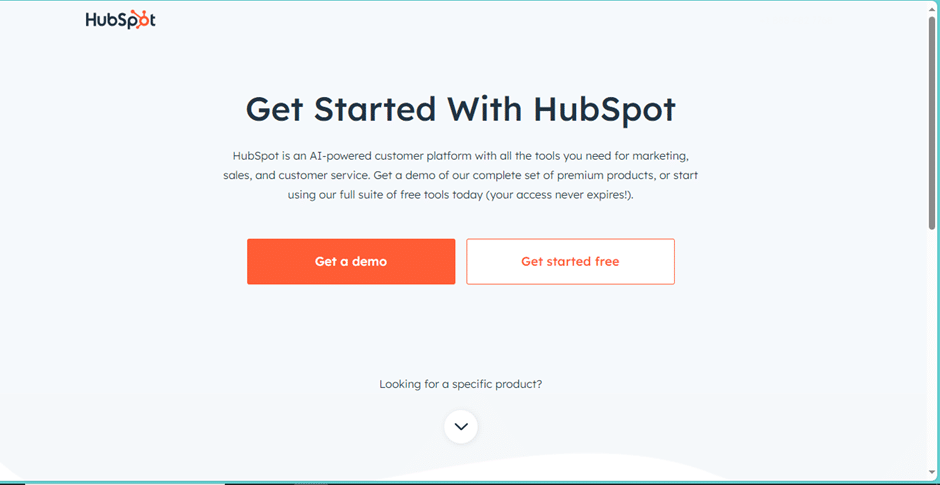
The click-through page is simple. That is the idea behind it is to inform an audience, in HubSpot’s case, in a few lines. Then get the user to click on the CTAs and go to the page with the demo/trial.
Click-through pages have the advantage of being minimal. Their only goal is to get the user to click on the CTA. This landing page is the perfect example of content in the latter stages of the buyer journey.
It helps users understand what services are offered and how to get there. It does not need to capture any leads because the user has shown interest in trying out the product.
Landing pages help creative teams flex their muscles. A/B testing is the name of the game. Experiment and optimize to find the formula that works.
How to create a landing page?
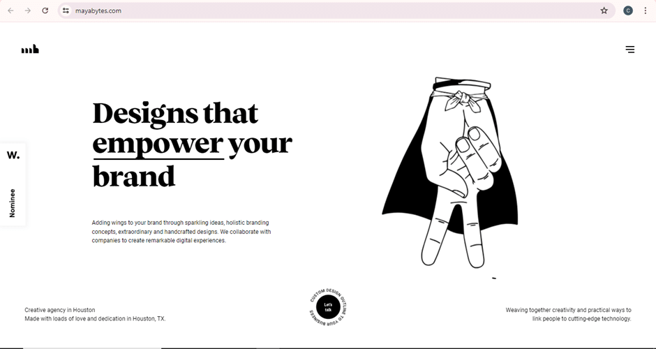
Landing pages are an opportunity to be creative. It is supposed to be eye-catching, and the copy has to be striking enough to call the user to action.
There are many landing page builders in the market: Unbounce, HubSpot, Squarespace, and Zoho are some of the popular ones. They offer beautiful templates for a beginner to start.
But most B2B businesses are not beginners they need a landing page that conveys a unique voice. To create a landing page: –
Goal of the page
Every landing page must be unique to the campaign. To create an exceptional landing page, it is imperative to understand the goal.
- Is the landing page meant to find high-quality leads, or is it a click-through page?
- What action must the user take once they land on the page?
Understanding the audience
Every marketer needs to understand the audience they are reaching. Sales & marketing alignment is one of the best ways of understanding the audience and their pain points.
Understanding the target audience makes the message clear and engaging. The landing page is about developing a relationship with the audience and speaking to them and their pain points.
In our programmatic ads blog, we go in-depth with ICP creation, one of the cornerstones of understanding target audiences.
Essentially, it says that to understand an audience, marketers must analyze the habits of their users.
What draws the user in?
After understanding the audience and their pain points, it is time to
Design The Page
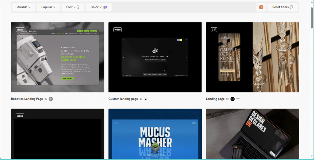
Most landing pages are well-designed, sleek, and to the point. Neil Patel has a list of beautiful and compelling landing pages.
The design of the landing page must reflect the intent and tone of the brand. Some guidelines for effective landing page designs are: –
- Simplicity: The page needs no distraction. It is created with a purpose and must serve that purpose.
- Color that reflects brand value and landing page purpose: Using colors to inform messages is an age-old tool.
- Media: Landing pages with videos are more eye-catching and engaging and are better at converting. Using informative videos and high-quality photos on the landing page is vital to increase its chances of converting a user to a high-quality lead.
- Content Placement: This includes CTAs, text, and videos. Content placement requires a little bit of testing. For obvious reasons, eye-catching content and CTA should be above the fold. After that, experiment to see how users interact with the page. What are the hot spots of the landing page? Microsoft’s clarity is a tool that can help designers analyze user behavior.
- Whitespace: Whitespace is essential as it helps create a sense of balance.
- Mobile Optimization: Most landing page users will visit from smartphones or tablets. Optimizing content for these devices is crucial; we all know how users leave pages if it is slow or unoptimized.
Content
Content, in our opinion, is part of the landing page’s design. But it is necessary to give content its section.
Convincing content is created by empathizing with the audience. Creating content with the user in mind makes content engaging and personal, which is its goal!
- Write content that is benefit-driven, not feature-driven
- That means understanding the B2B buyer’s pain points and letting them know how you can help them solve them.
- Include clear and strong CTAs in your landing page.
- Use headings and subheadings to divide your page. It makes it easier for users to skim the content and quickly grasp the message.
Creating a landing page is relatively easy. The focus is always on simplicity, reaching the buyer, and nurturing them to click and convert.
Every landing page must consider its buyer and craft a relevant message. But how do you reach an audience and engage them thoroughly?
For that, we must optimize and experiment. Let us take a page out of growth marketing’s playbook and understand
A/B Testing, optimization of the pages, and why it is necessary.
Marketing is undergoing a sort of renaissance. Growth Marketing, personalization, and Omnichannel marketing are all part of this change in marketing. A more buyer-centric model of reaching out to prospects and potential buyers.
Buyer-centric models of marketing require optimization. Landing pages are one of the finest examples of optimizing for the buyer.
A/B testing is a flexible way of optimizing landing pages. A/B testing provides actionable data for marketing efforts.
For landing pages, we must segment our audience and create campaigns for each segment. But what happens when we give a segment two different pages at random?
The two pages will have the same intent, but the content is different.
Then by user action analysis, data is gathered on which page performs better and understanding why! A/B testing, when done correctly, can transform your landing page strategy to convert more users. This is known as conversion optimization.

